Overview
Northwest College of Art and Design
A Tacoma, WA based client needed a website redesigned to create a consistent design system that reflected their marketing collateral in order to compete with other small, local art schools.

Timeline: 12 weeks
My Role: UX Research, Developer
Team: Content Writer, Social Media Manager, Sales Manager, Brand and Graphic Designer
Business Goals
Increase Applicant Pool
The primary marketing touchpoint for NCAD was presentations given to high school classrooms. Their website was the secondary touchpoint for potential students who were thinking of applying. Administrators were seeing a reduction in their application pool each year, and they wanted to achieve at least 100 applicants for the following year. We approached this goal with both a social media strategy and a new web design.
High Level Goals
Preliminary Research
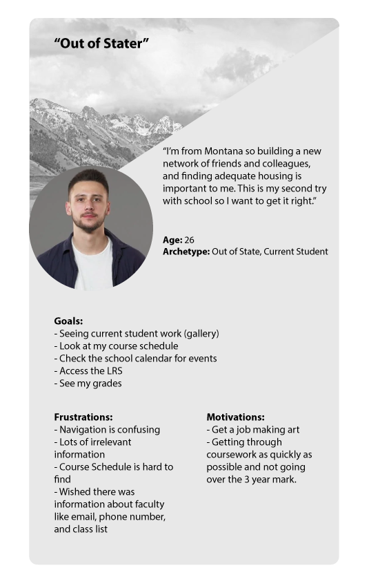
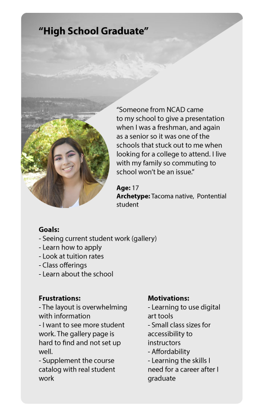
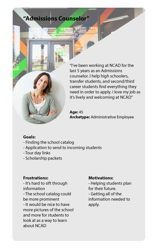
I conducted competitive research with three other local art school websites, and surveyed current students and administrators to determine their overall motivations, goals, and frustrations with their current website. With this information we determined a few high level points to inform the new design:
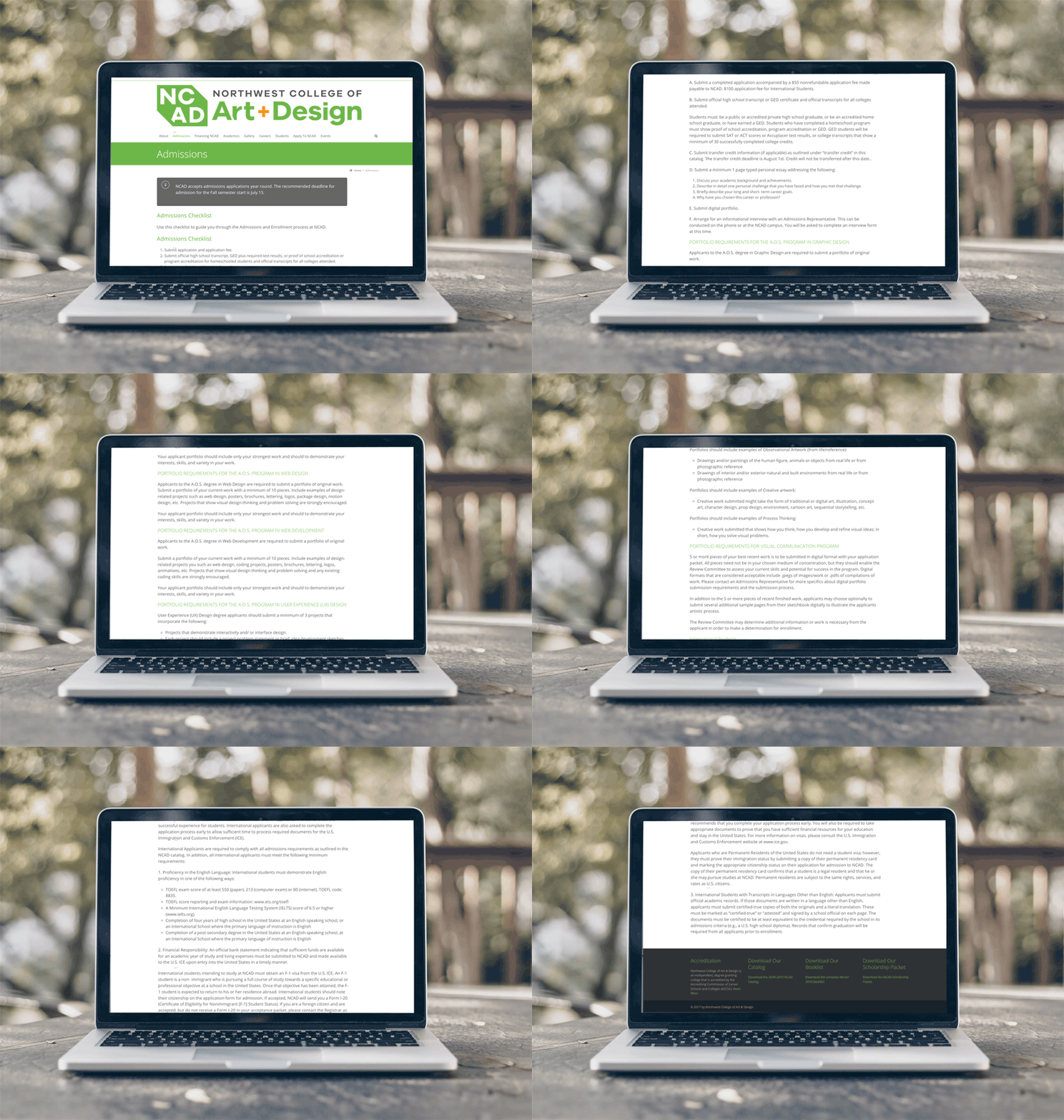
- Eliminate walls of text and make information easier to digest
- Inject photos of student life into the site
- Add more student work
- Streamline navigation
User profiles that informed the site redesign
Click to enlarge
In-person and Online
Tools and Methods Used
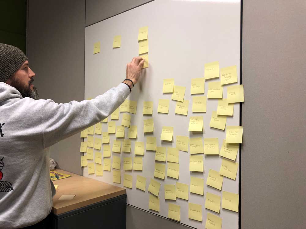
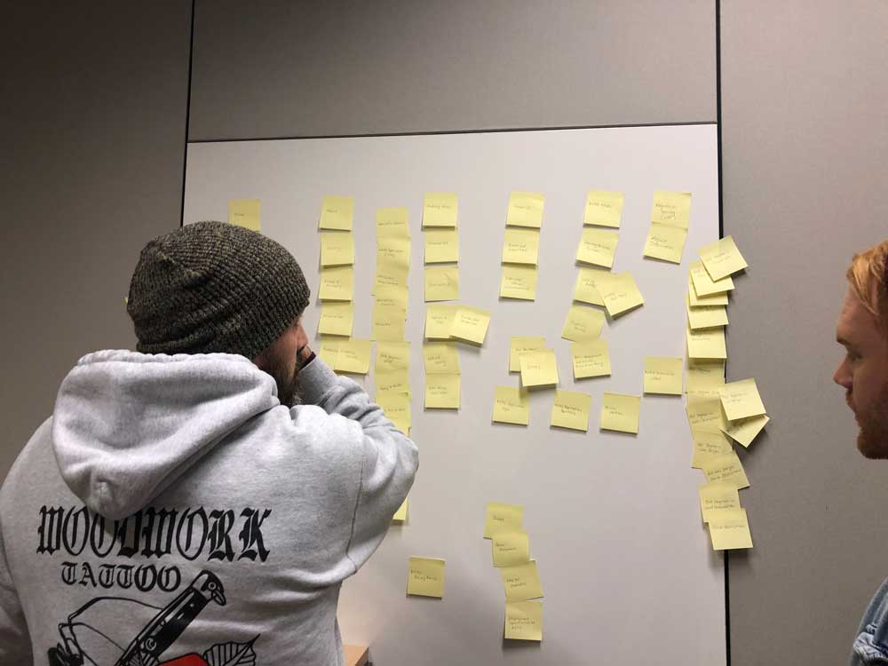
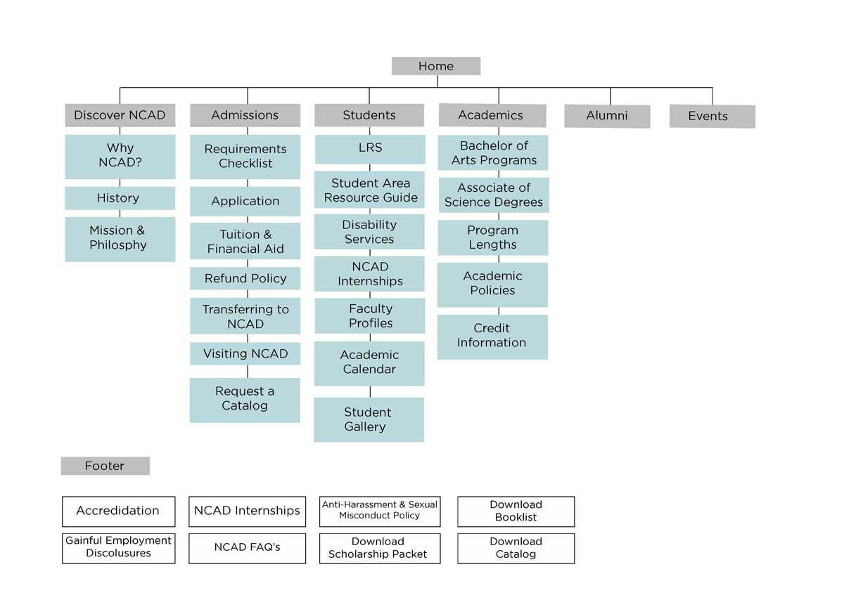
Surveying current students and administrators revealed a need for restructuring the website’s navigation so that it prioritized important links for potential students, current students, and administrators who all used the site heavily for information about the school, events, current class listings, or access to the school’s portal. I also conducted an open card sort in person with school administrators, along with two rounds of closed virtual card sorts in which 25 current students participated.
Final Sitemap
Click to enlarge.
Branding and Cohesion
Evoking Experimentation
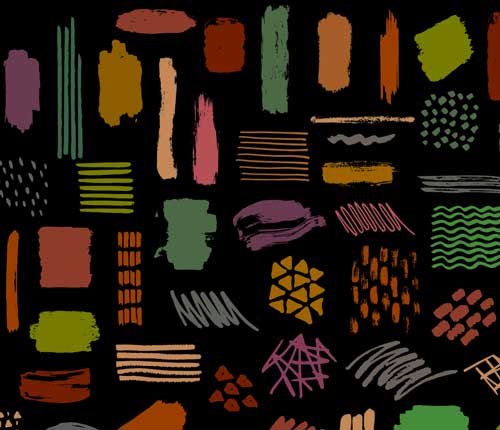
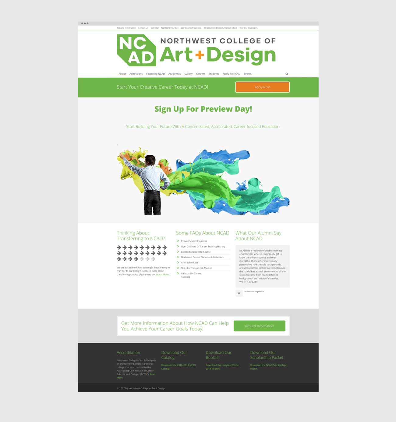
We refined NCAD website’s design system to make it cohesive with the established marketing collateral. Our design intention was to elevate the site’s look and feel to promote authenticity to potential students, while reflecting the spirit of the school to existing students. We achieved it in the curation of assets – experimental and action oriented art for the background images, such as paint textures on paper, computerized designs and patterns – showcasing digital and organic art mediums that are nurtured in design school.
The updated web design and social media strategy brought in 20% more applicants than their targeted goal in 2021.

