Overview
QA Group
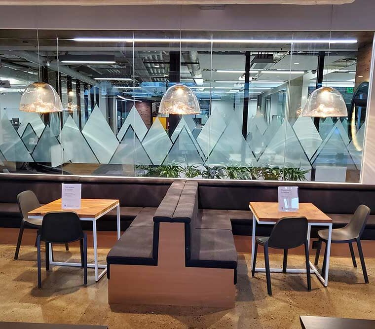
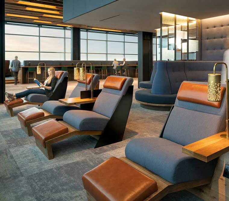
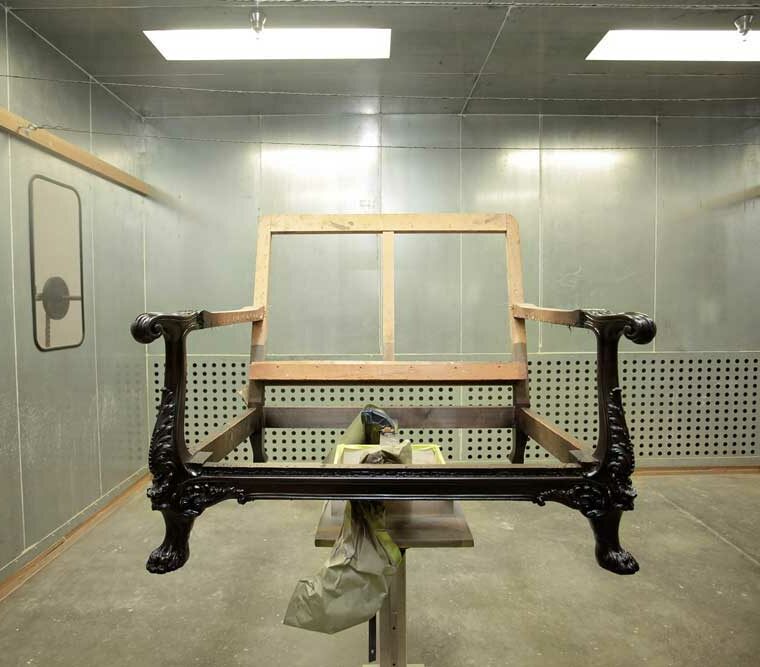
A respected local furniture company was transitioning to a national, commercial business model and needed a revamp of their web branding. The company wanted to appeal to commercial clients around the country while still keeping all of their design work and furniture building in-house. It was important to convince potential clients that they were a one stop shop when it came to commercial, private, and architectural interior designs.
Timeline: 8 weeks
My Role: UX Researcher, Designer, Developer
Team: Content Writer, Sales Manager, SEO Manager, Client Marketing Manager
The Approach
Heuristic Evaluation
I conducted a heuristic evaluation via task analyses with four other developers to determine usability errors, using Jakob Nielsen’s 10 general usability principles, on QAGroup’s old website. We determined 5 areas for improvement:
- User control & freedom
- Consistency & standards
- Recognition rather than recall
- Flexibility & ease of use
- Aesthetic & minimalist design
Solutions
QA Group Redesign Initiative
I broke up proposed solutions for the client into three categories:
Content Strategy
- Text limit to not exceed 45-85 character text width, or increase padding to shorten line length (keep things easy to read, scannable, and succinct)
- Lead users to complete their tasks with a call to action on every page that either encourages a conversion, or leads to an inner page to reduce overall bounce rate, increase session times and conversion rates
- Include explicit language for calls-to-action (‘Request a Quote’, ‘Most Recent Projects’, ‘Send A Request’) to increase user engagement
- Streamline the navigation to reduce confusion
- Curated content to engage clients and convert them into leads
- Remove extraneous copy and reorganize blocks of texts
Web Accessibility Standards
- Implement breadcrumb navigation and search bar to increase navigability
- Create hover/focus/active states
- Include ‘skip to content’ button
- Standardize accordion features across the site
- Break up copy to make content digestible on resource pages for both desktop and mobile.
Assets
- Include projects on individual product pages to highlight relevant work
- Add better quality photos of relevant projects
- Alt tags on images
- Use images of team, show rooms, process photos, candid shots of people working etc. throughout the site
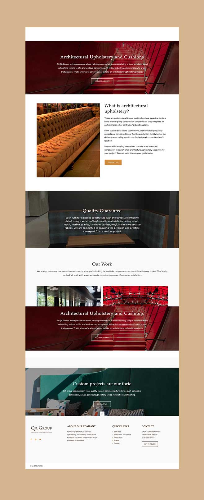
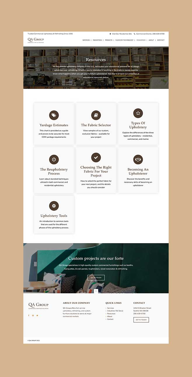
Examples of high fidelity page designs. Click and zoom in to enlarge.
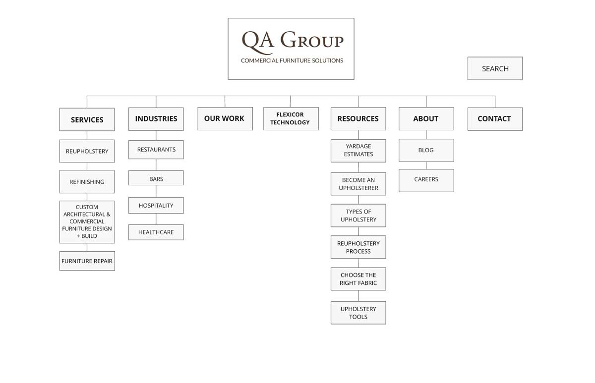
Improved Sitemap
After reviewing our proposed ideas for the new site, the client wanted to clean up the sitemap and remove extraneous or confusing pages that no longer spoke to the goals of the business. For example, removing the ‘Products’ section of the site was important to focus on bespoke pieces for each unique commercial design, rather than stock pieces offered.
I created a closed card sort for employees at QAGroup to organize, as well as 10 random users. The results were as follows:
Click to enlarge
Setbacks
Battling Scope Creep
Each project has unique challenges that can prevent a product from shipping on time. In this case, the client introduced new stakeholders with new information, late in the process, after the site was developed. This pushed development back by months and even prevented the site from launching. It is currently still in development.
